The problem
A local roaster needed to sell beyond the café counter — beans online, and retention through subscription rather than one-off orders.
What we did
Built a neo-brutalist wordmark: heavy grotesque, mirrored Ǝ, black-and-white base with no gradients — so it holds up on a bag, a sign and a screen alike.
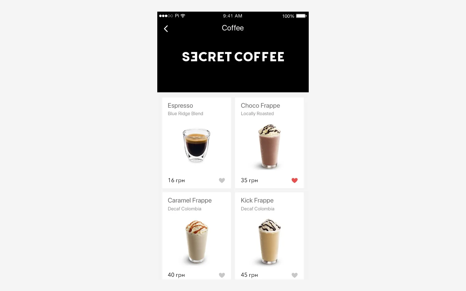
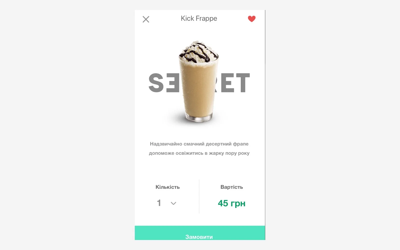
Designed a coffee subscription app: drink catalogue, product card with recipe, volume selection, order from the nearest café.
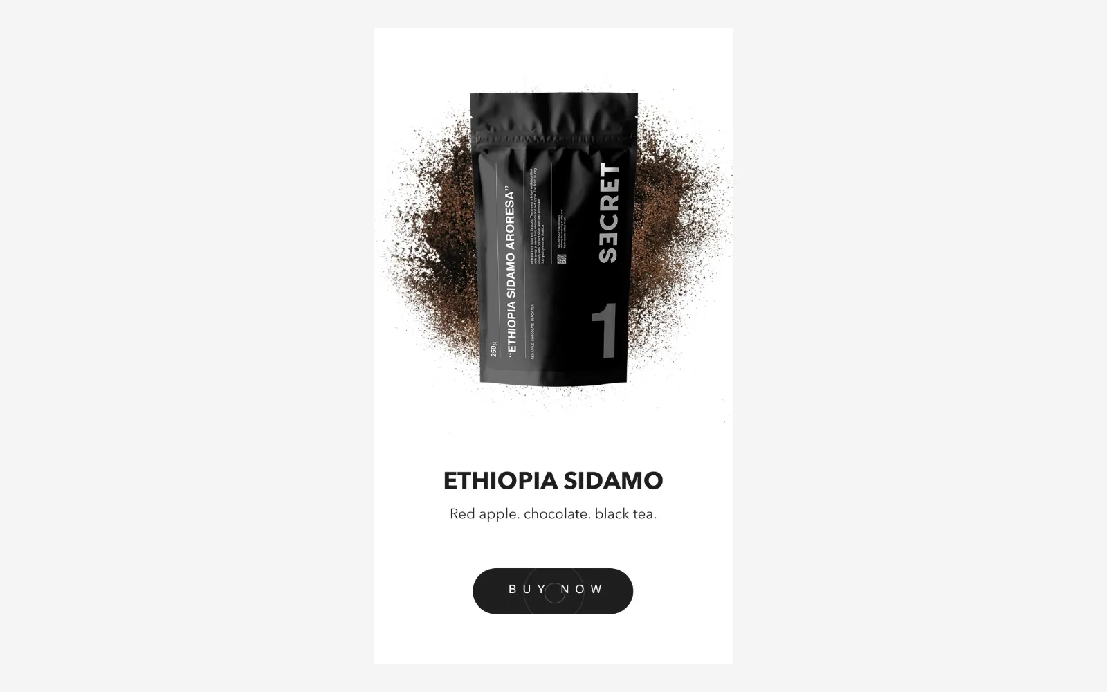
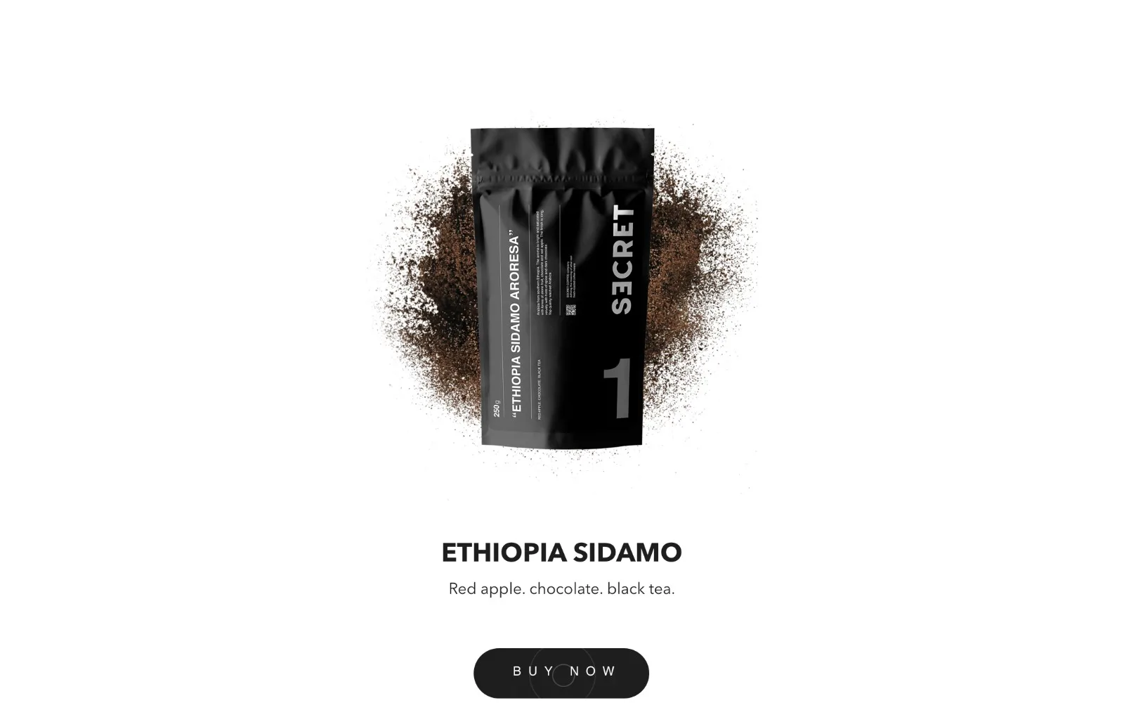
Carried the system into the online store: single-origin beans (Brazil, Ethiopia, Nicaragua), drip packs, decaf, blends.
Outcome
The store is still running — five years after the identity launched. That's the strongest proof a studio can have: the brand works without us.
Scope